
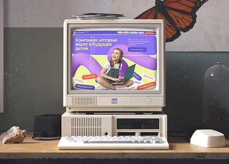
 New! Website, brand book and mascot for a school in New York
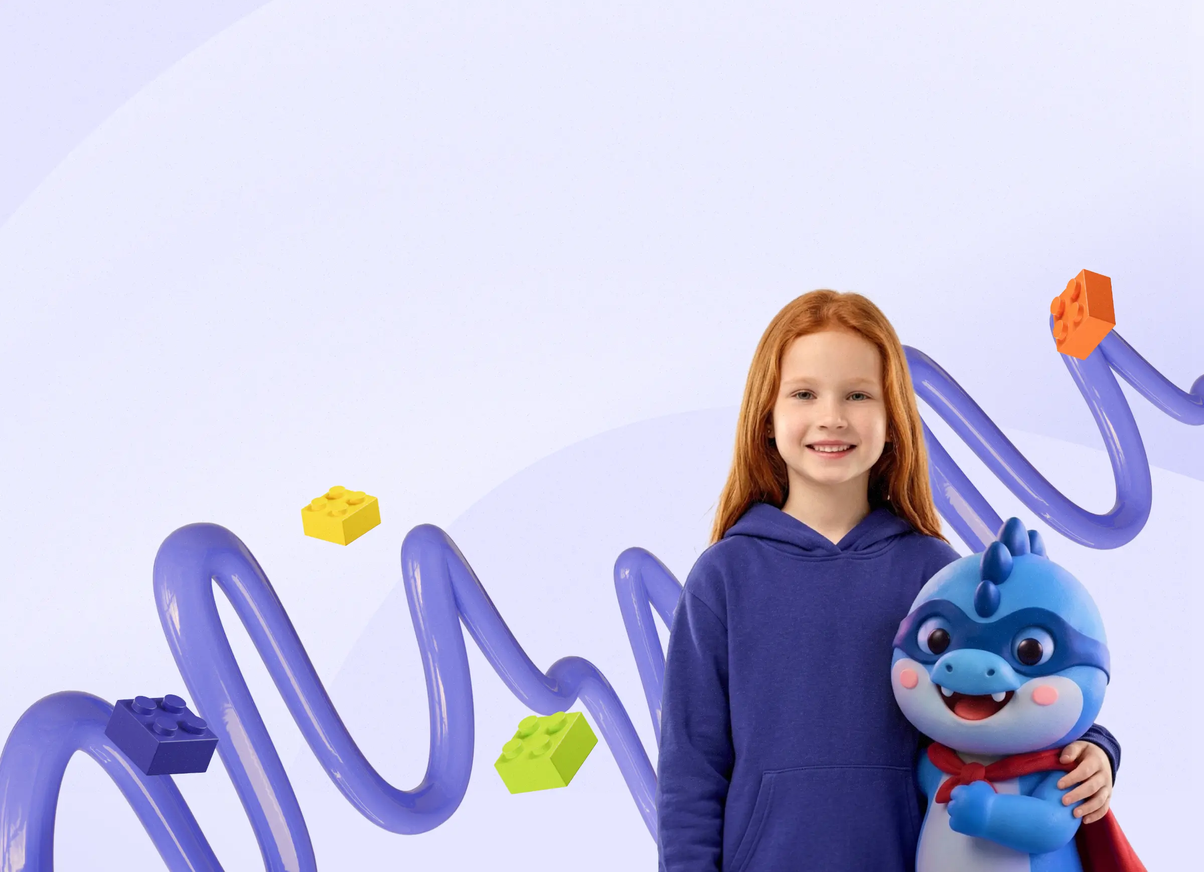
We made a new website for the GoCoding IT school in Brooklyn and put together a brand book: colors, a typeface, graphics and the hero dragon. From the first screen a parent sees what the children are taught and can sign up for a trial lesson.
GoCoding School

The task
The GoCoding school in Brooklyn had its own style, but the website and the materials looked like a set of separate solutions. A new website and unified design rules were needed so that a page, a banner and a souvenir would look like one school.
The main idea: not to draw everything from scratch. We took the school’s previous style as a base, simplified it and added new elements. The result is a system in which every element has its own task.
What we did
-
The first screen and the parent’s path
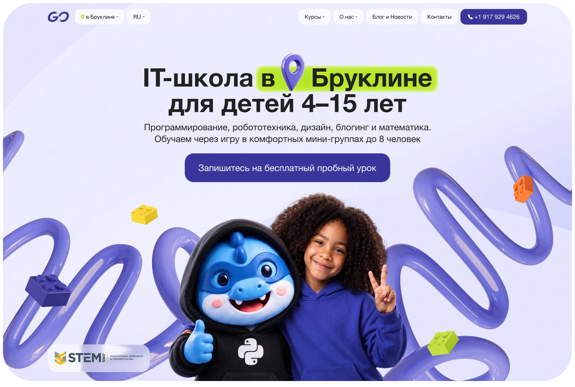
The headline answers the parent’s main question at once: what school this is and for whom. Next to it are a smiling child and Gogo the dragon, so that the site looks alive and friendly. Then the page leads to signing up step by step.
- For whom. Children from 4 to 15, groups of up to 8.
- One action. A big button “Sign up for a free trial lesson”.
- Trust. The STEM.org mark in the corner of the first screen.
The parent’s path through the page
- First screenwhat is taught and for whom
- Coursesareas and ages
- Truststudents’ works and the team
- Sign-upa free trial lesson
-
Why GoCoding
Next the site answers the question “what makes you better than the others”. We collected four reasons into cards with volumetric icons, and highlighted the third one with a color and a slight tilt.
- Flexibility and care. Mini-groups of up to 8 people, missed lessons are easy to make up.
- Progress in focus. Regular feedback from teachers.
- Practice and results. We teach through play and the children’s own IT projects.
- Teachers who are easy to understand. They explain complex things in a language children understand.
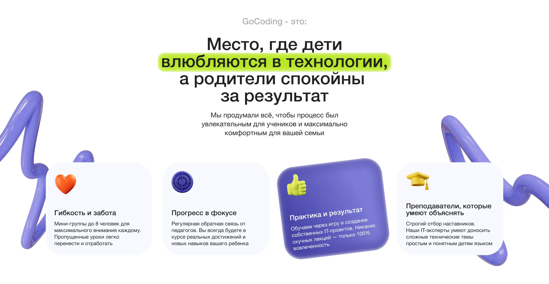
Four reasons to choose the school -
Courses
The school’s areas are collected in cards with a slider. Each shows the number of courses, the children’s age and a “View all courses” button. Gogo stands on the cards in the costume of the right course.
- Easy to choose. Robotics, game development, programming and other areas in separate cards.
- Help with choosing. Next to it is the “We will help you choose a suitable course” banner with a trial lesson sign-up.
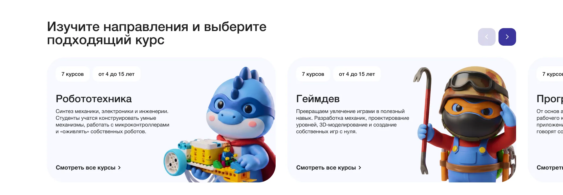
Cards of the areas: robotics, game development and others -
Students’ works
So that parents would believe in the result, we showed real works by children. For example, a Halloween scene in Unity 3D made by a 13-year-old student. Next to it are a description of the project and a lesson sign-up button.
- A live example. A parent sees what a child can make on the course.
- Easy to browse. The works switch with arrows and thumbnails on top.
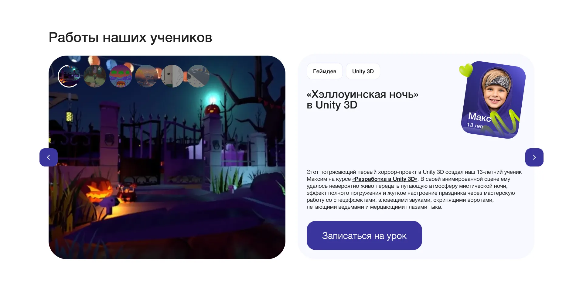
Students’ works on the courses -
Team
It matters for parents to know who will teach their child. That is why the site has a team block: each person has their own photo, name and role: director, founder, manager, teacher.
- Face and role. Each has their own card on a background of the brand’s 3D lines.
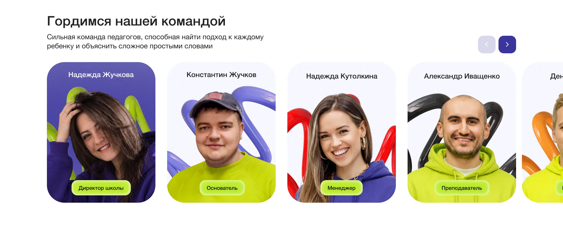
The school team -
Events, social networks and a call to sign up
Below are Bento-style blocks: on the left a story about Gogo and a link to the school’s events, on the right social networks and a bright call to start an IT adventure. Blocks of different heights stand tightly together, like in a construction set.
- Social networks. Instagram, YouTube and Telegram in one row of buttons.
- One more sign-up button. The “Sign up now” call repeats where a parent is already ready to decide.
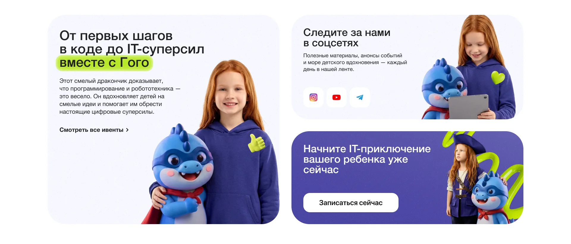
Bento-style blocks -
Signing up for a trial lesson
The form is short: the parent’s name, the child’s name and age, email and phone. Next to it is a girl with a laptop and a thumbs-up, so that signing up looks friendly.
- Few fields. The form can be filled in quickly, from a phone as well.
- Clear consent. Separate checkboxes for the privacy policy and for the child’s data.
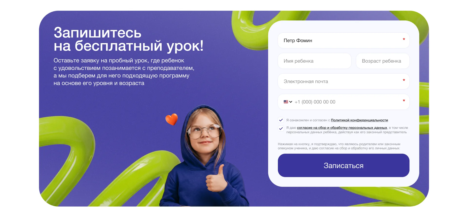
The sign-up form for a free lesson
Brand book
Together with the website we put together a brand book, a presentation with the style rules. With it any designer can make a new page, banner or souvenir in the school’s style without guessing which color and which typeface to use.
-
The concept: evolution, not a new start
We simplified the school’s previous style and added new elements. It was important to keep it recognizable: parents and children should see at once that this is the same school.
- Continuity. The recognizability is kept, and the style became simpler and neater.
- System. Every element works for the common style.
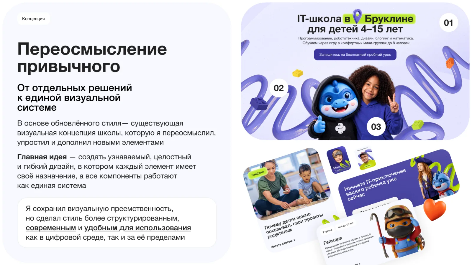
The brand book page about the concept -
The Bento style: blocks like a construction set
A page is assembled from separate blocks, like from a construction set. Each block has its own task, but they are all in one style, so they can be freely rearranged and combined.
- Flexibility. The blocks are easy to adapt to the website, advertising and social networks.
- Convenient to work with. Such blocks are easier to scale and maintain in code.
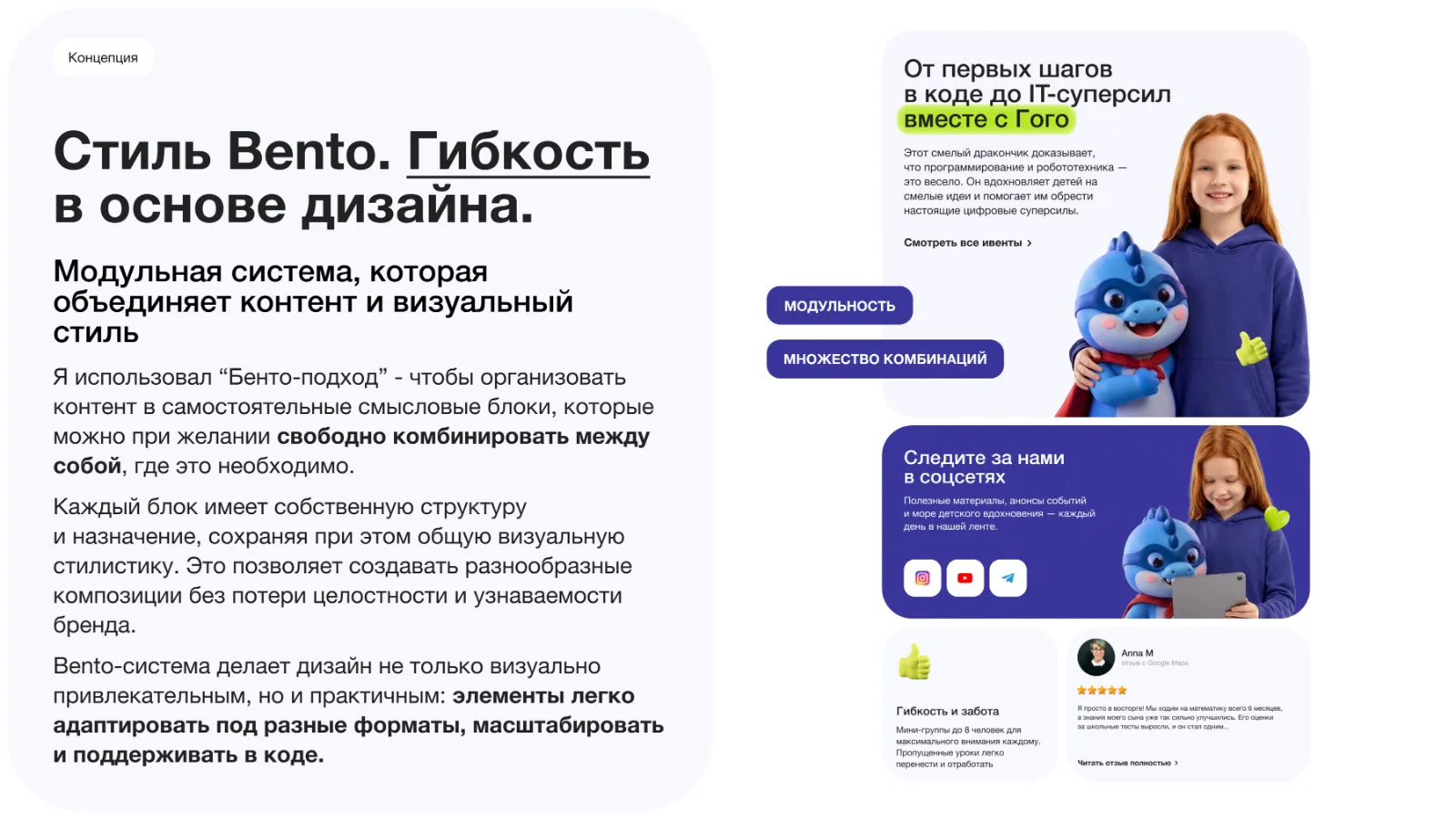
The brand book page about the Bento style -
Colors
One main color and a few helpers. The base is the brand indigo, the light background keeps the page airy, and the bright lime draws the eye to the main thing.
- GoCoding Indigo #39359C. The main brand color.
- Cloud White #F7F8FF. The main background color.
- Electric Lime #B9EB1A. The main contrast and accent.
- Graphite #222222. The main text and dark blocks.
- Red, orange, yellow. For graphics only.
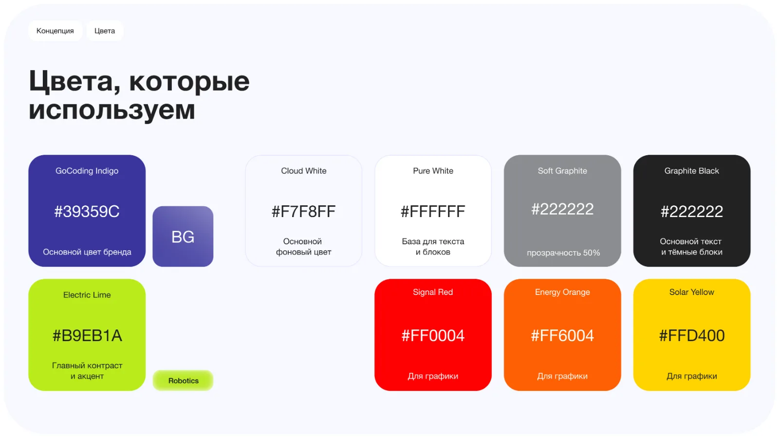
The brand palette -
Typeface
One typeface for the whole brand: Helvetica Neue. It is clean, reads well and does not compete with the bright graphics.
- Three weights. Regular, Medium and Bold.
- Order. One typeface makes the pages consistent and simplifies maintaining the style.
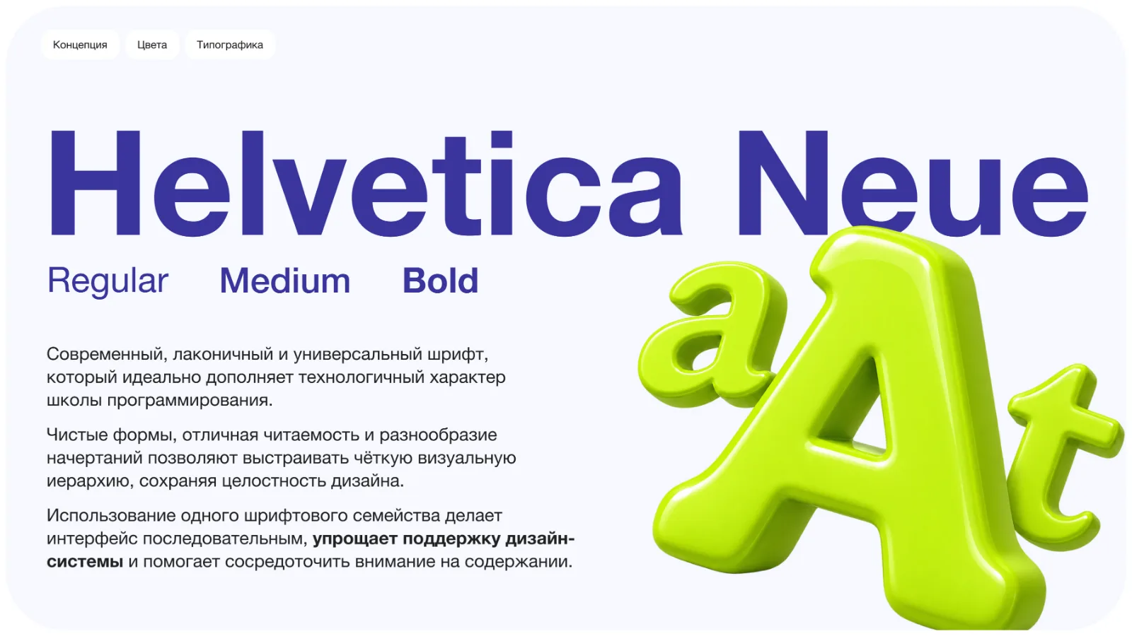
The brand typeface -
Graphics
The main device is the volumetric 3D lines. They used to be just a background, and now they are an important element of the style. We added 3D icons to them: they explain the learning areas and add emotion.
- Five line variants. Lime, indigo, red, orange and black.
- Volumetric icons. They help to understand the area and bring the page to life.
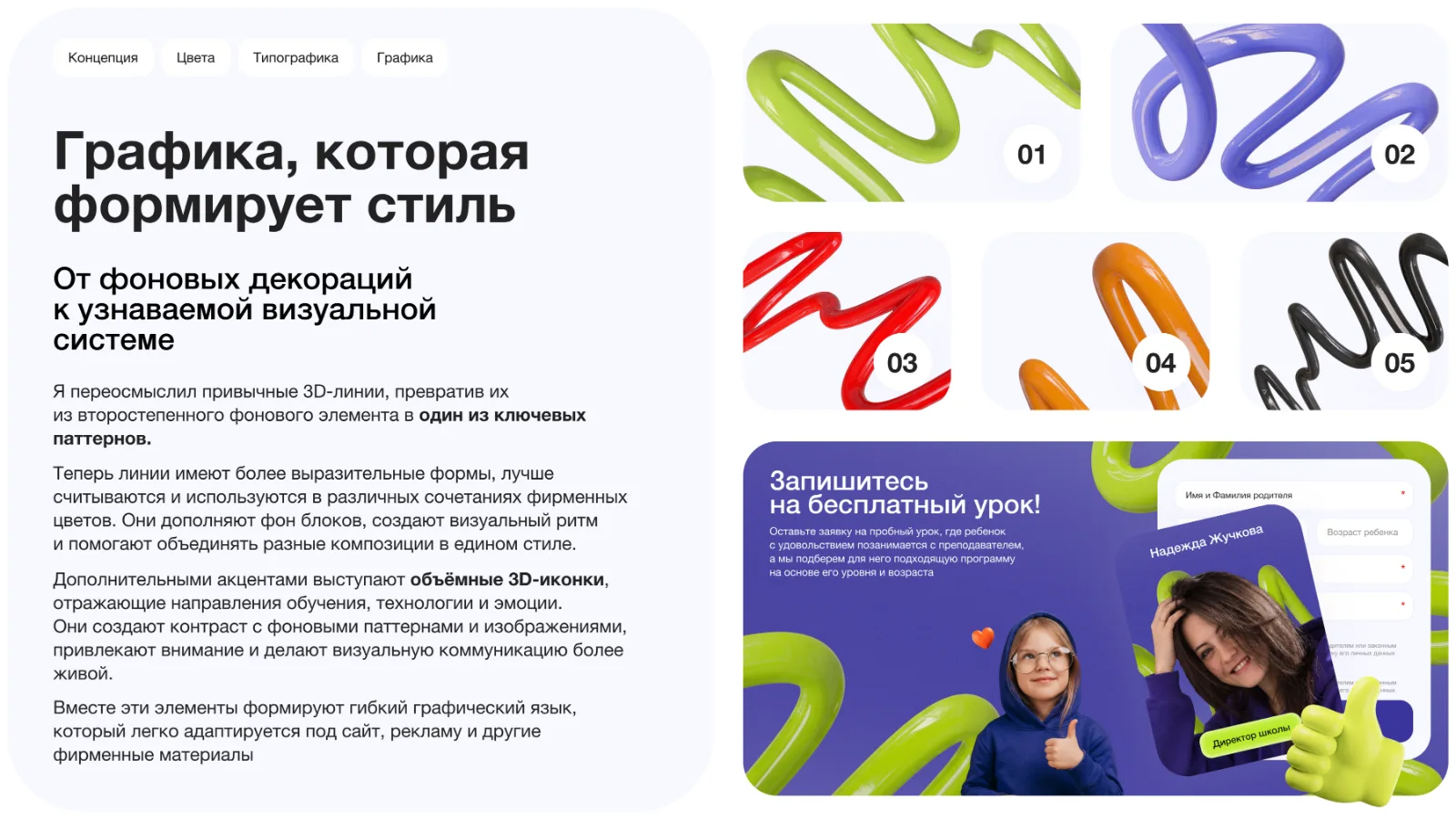
3D lines and icons -
The brand hero
Gogo the dragon became the brand hero. He is on the website, in illustrations, on the course cards and on souvenirs. How we came up with him is in a separate project, “Gogo the Mascot”.
- Looks for the courses. Every course has its own costume for the hero.
- Not only a website. The hero works for advertising, souvenirs and games.
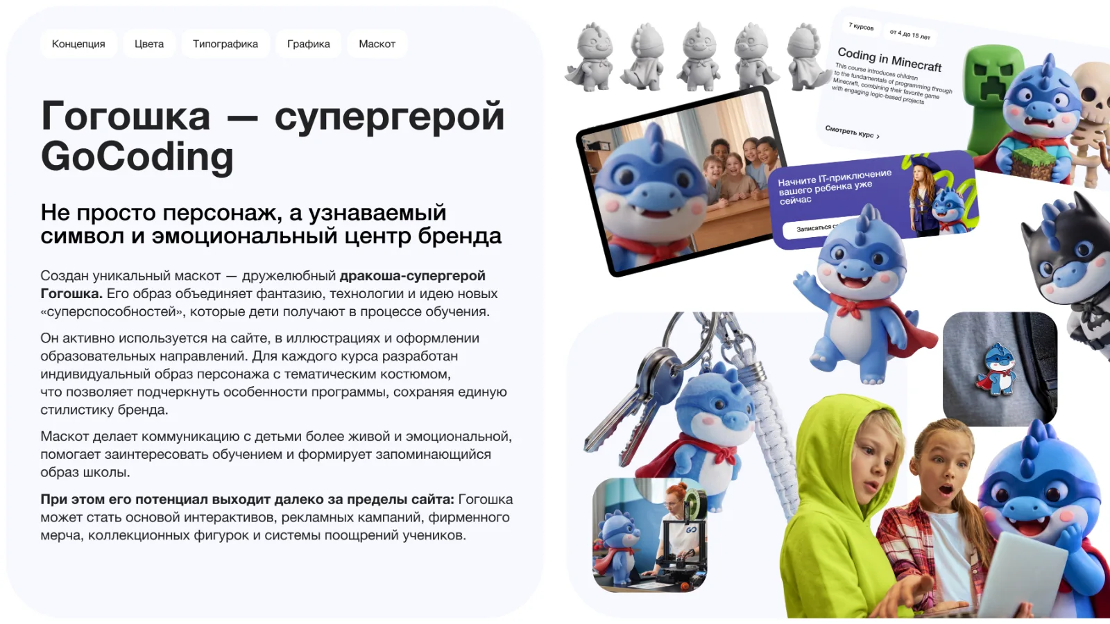
The brand book page about the hero
Advertising and banners
From the same elements we built banners for the website and advertising: a bright background, 3D lines, a child or Gogo and a single button.

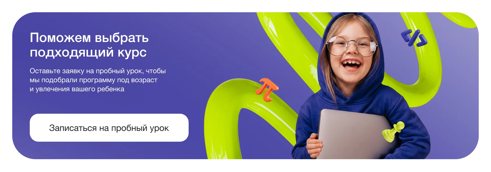
The result
- The first screen says what is taught and for whom, and leads to a single action: signing up for a trial lesson
- The website is made of Bento-style blocks: they are easy to change and add
- The brand book records the colors, typeface, graphics and the hero so that the style does not drift apart
- The hero Gogo ties the website, advertising and souvenirs into one story
What the work included
- Website design
- Website development
- Brand book
- 3D graphics
- Banners
- Sign-up form
Client review
It is important for parents to understand at once what the children are taught and to sign up for a trial lesson. The new website solves this on the first screen, without extra steps.
Related services