
 New! Website, brand book and mascot for a school in New York
Landing page · 2025
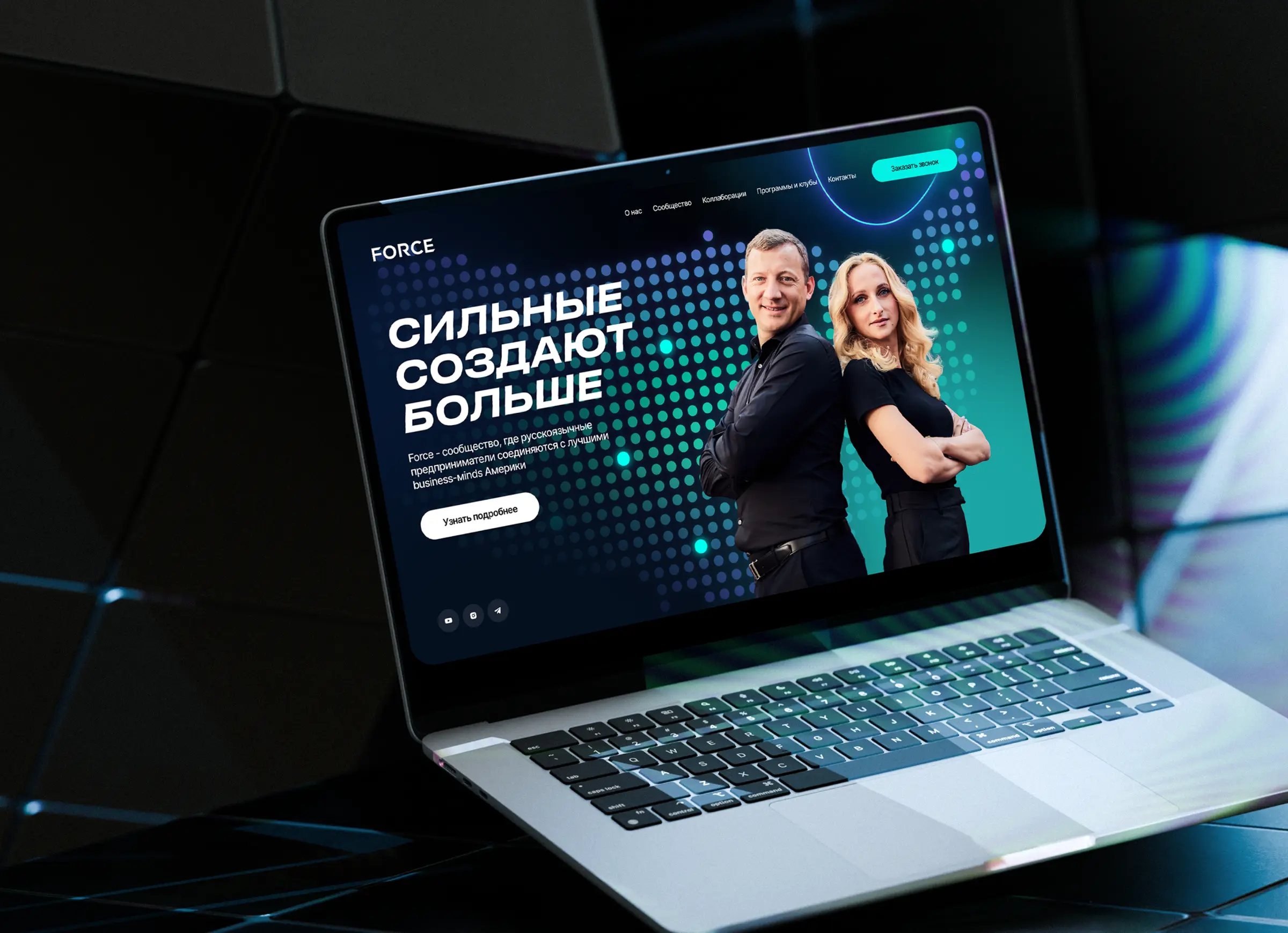
The landing page of the Russian-speaking business community Force in the USA
Force is a community where Russian-speaking entrepreneurs in the USA meet and find partners. We made a landing page and a mobile version: a dark style with neon turquoise, a dot map, volumetric icons and “Become part of the community” buttons on every screen.
Force

The task
A community needs a page that in one screen explains what kind of club this is and why to join, and then leads to a request. The audience is entrepreneurs who read a lot and trust people, not promises. That is why the page has many faces, projects and cases of members.
What we did
-
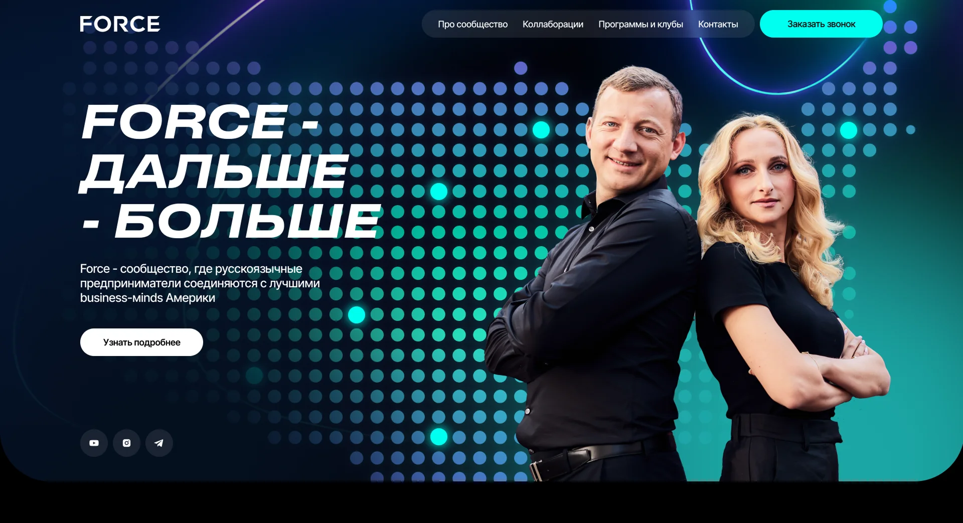
A neon dark style
A dark blue background, turquoise accents and a dot map on the first screen. A narrow bold typeface is chosen for the headings, and inside a heading the words are highlighted with color.
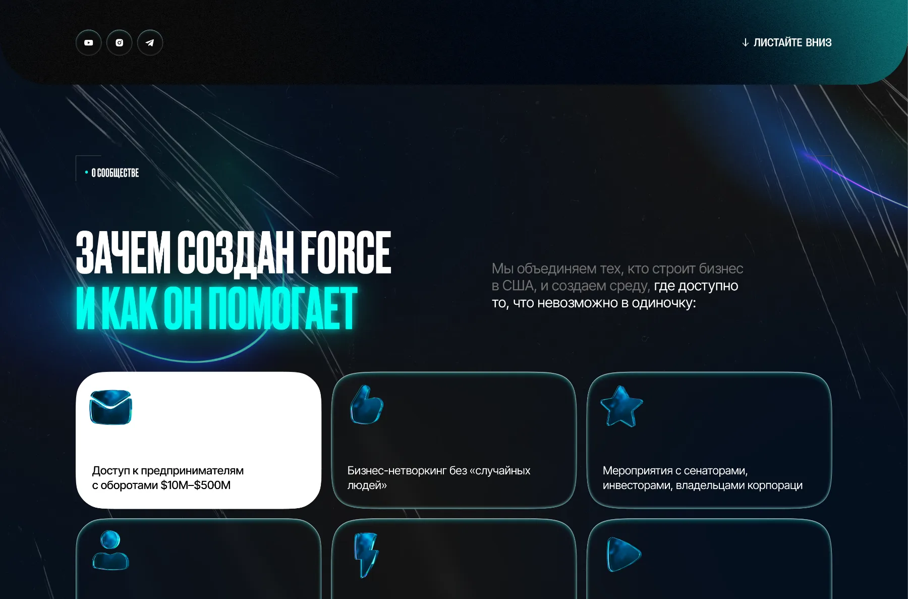
- Benefit cards. Six cards: the first one white and the others dark with volumetric icons, so that the eye moves in order.
- Colored words. In the headings the key words are turquoise and the rest is white.
Why Force was created -
The founders and today
The next block introduces the founders: a large photo and a list of important facts about each in glass cards. Below are cards about what the community does today.
- The face of the club. A photo of the founders on a dark background, with information in bars around it.
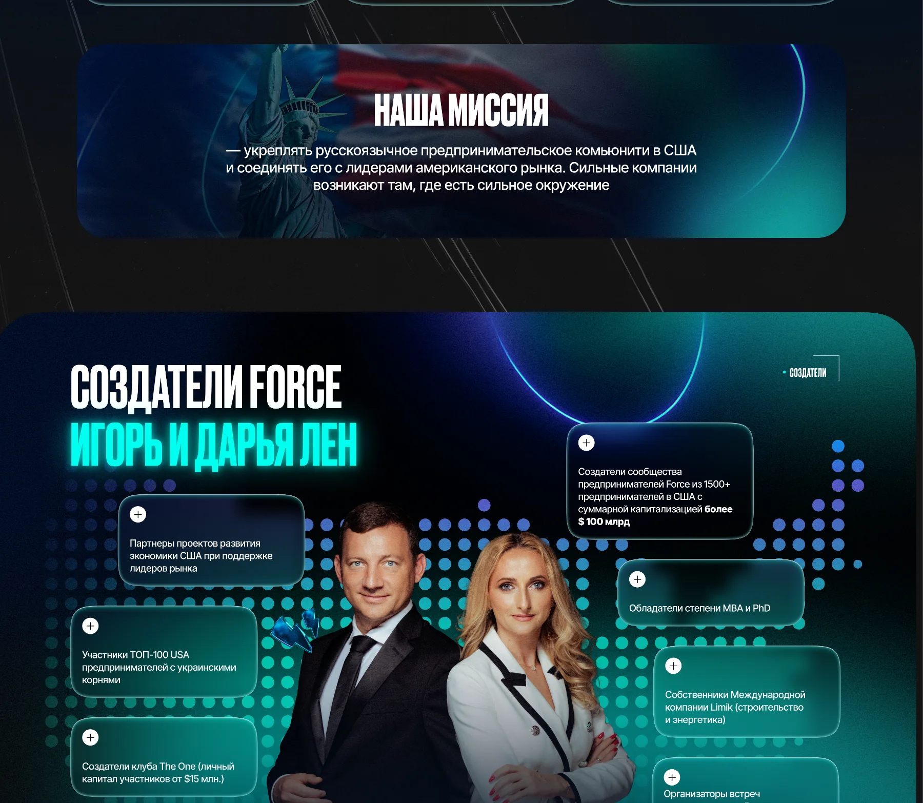
The Force founders -
Figures and projects
The figures are collected in tiles of different sizes: the first one white, the others dark with a turquoise frame. The club’s projects: a slider with photos on the left and an expandable list of projects on the right.
- Tiles like in a construction set. The different sizes make the block alive, not a table.
- Projects as a list. Each row expands and leads to the details.
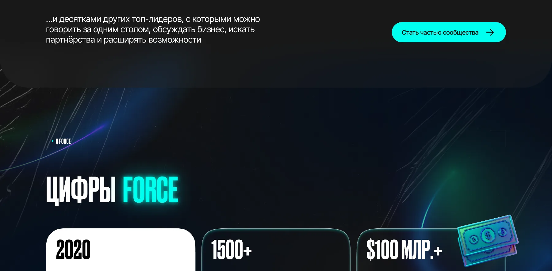
Force figures 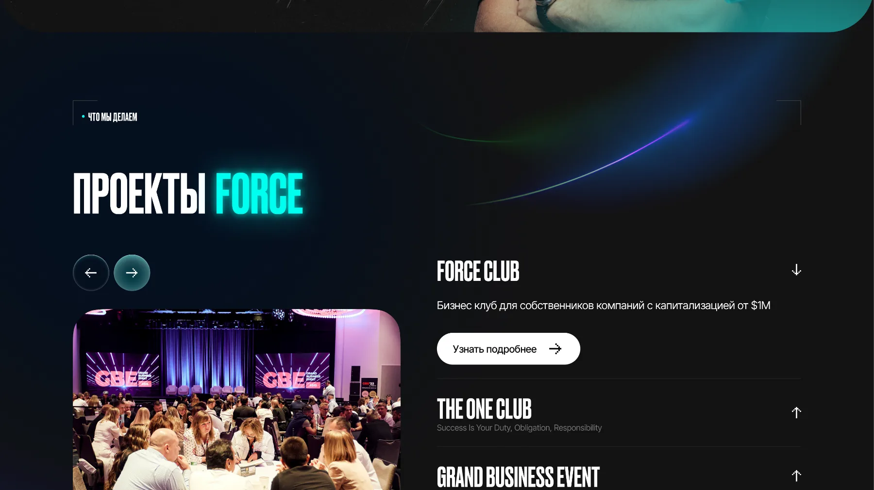
Force projects -
Members’ cases and reviews
The cases are shown as cards with a photo and a caption. The reviews go in a slider: a member’s photo and a short before-and-after story.
- People instead of slogans. Faces and stories convince better than general phrases.
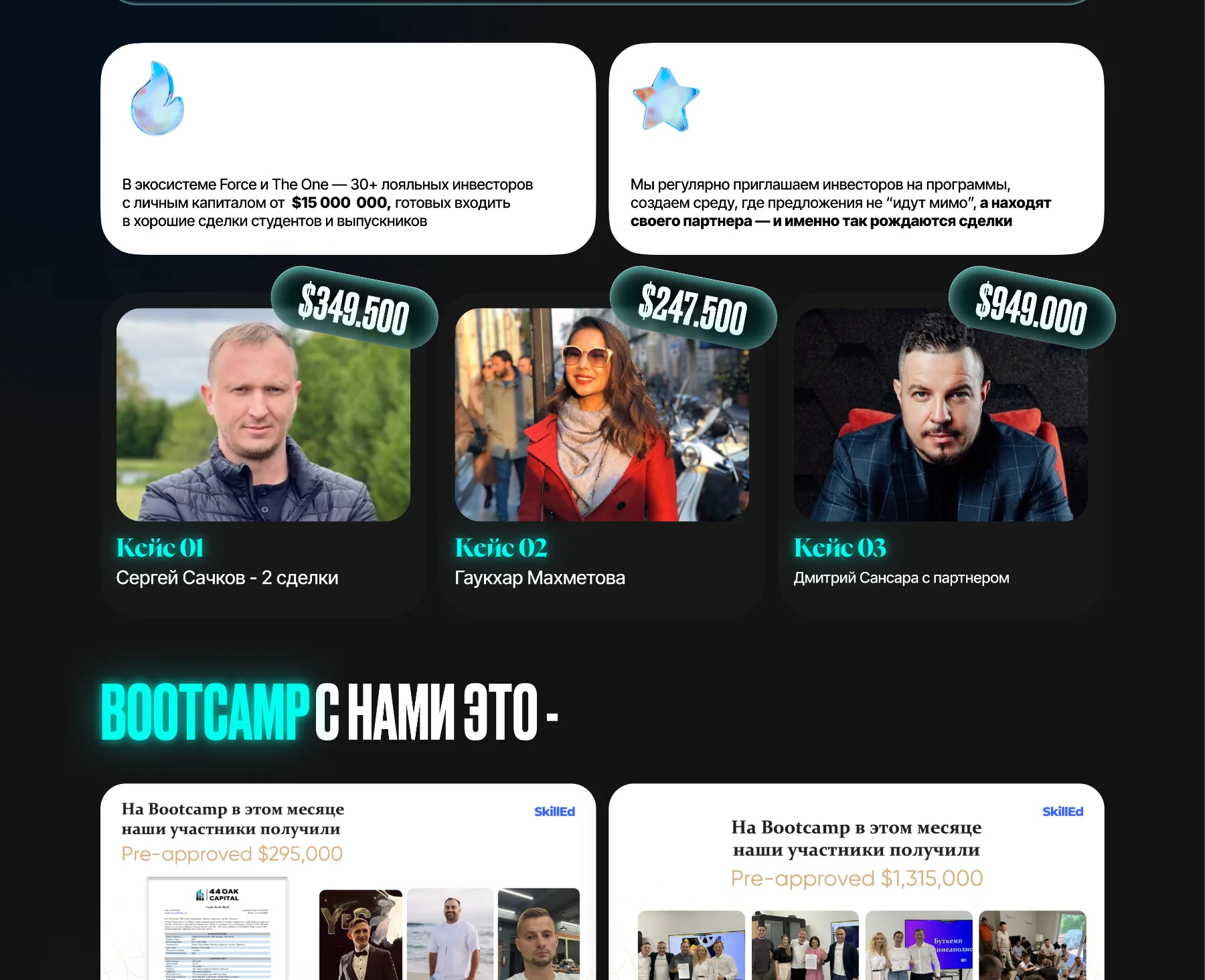
Members’ cases 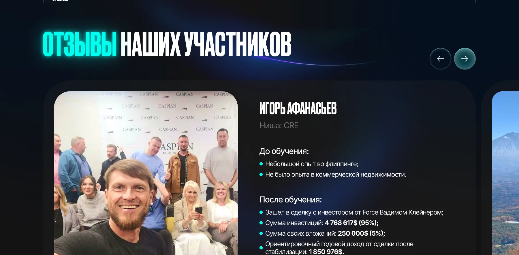
Members’ reviews -
The mobile version
On a phone the blocks stand in one column: figures in tiles, benefits in cards, and the “Become part of the community” button repeats where the person is already ready to decide.
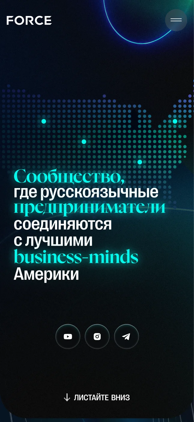
First screen 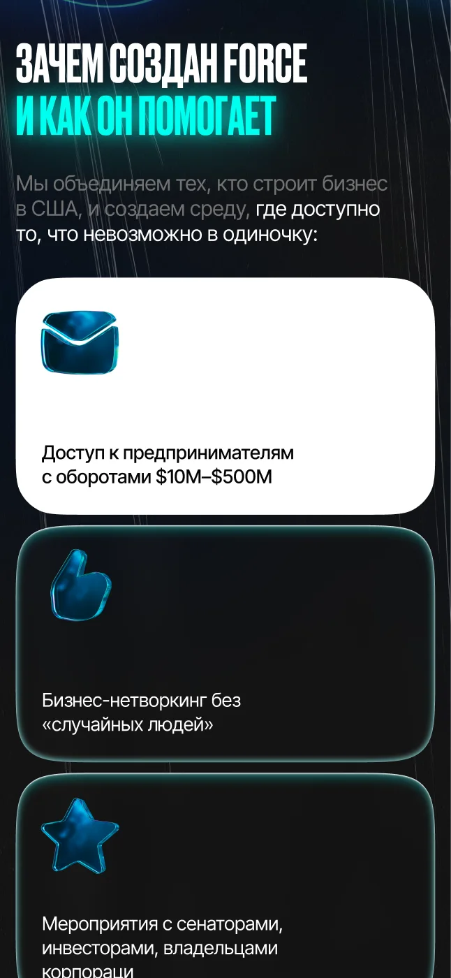
Why Force was created 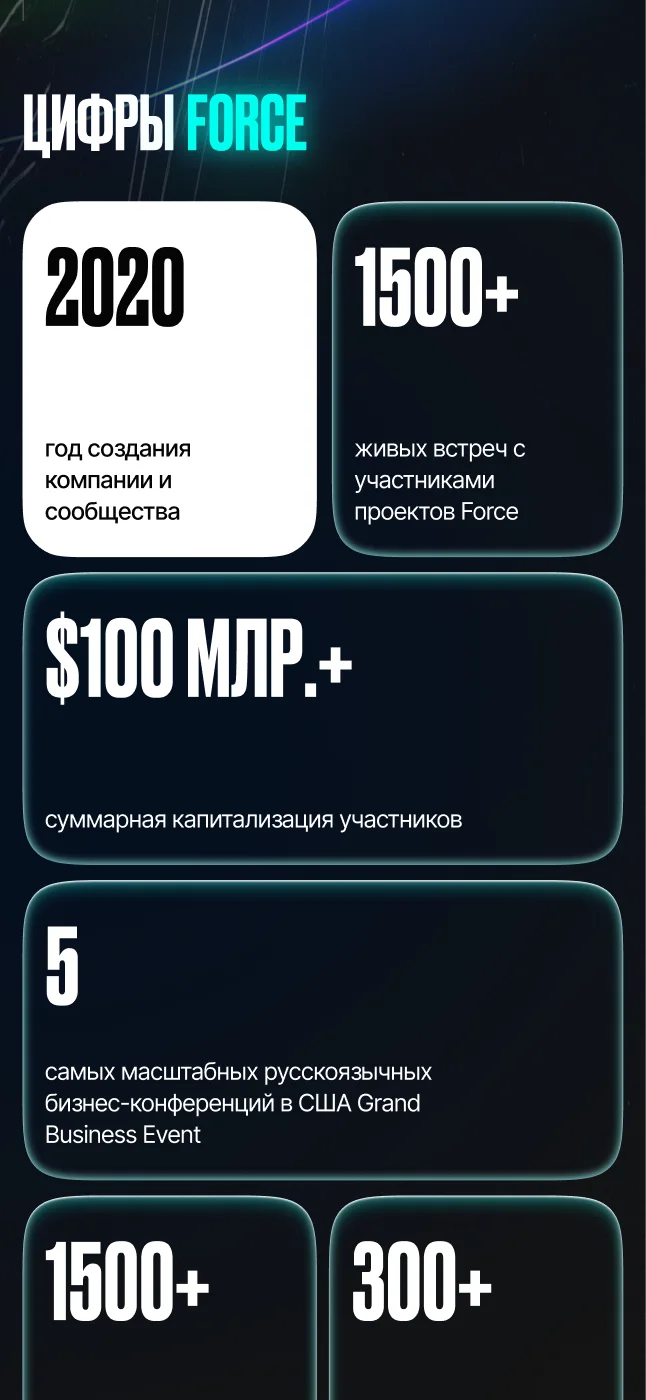
Figures
The result
- A bright neon look that is remembered at once and differs from ordinary business clubs
- A story about the community in cards: benefits, founders, figures, projects
- Cases, reviews and press mentions as proof
- A join button on every screen and a mobile version
What the work included
- Landing page design
- The page’s brand style
- Development
- The mobile version
- A request form
Related services