
 New! Website, brand book and mascot for a school in New York
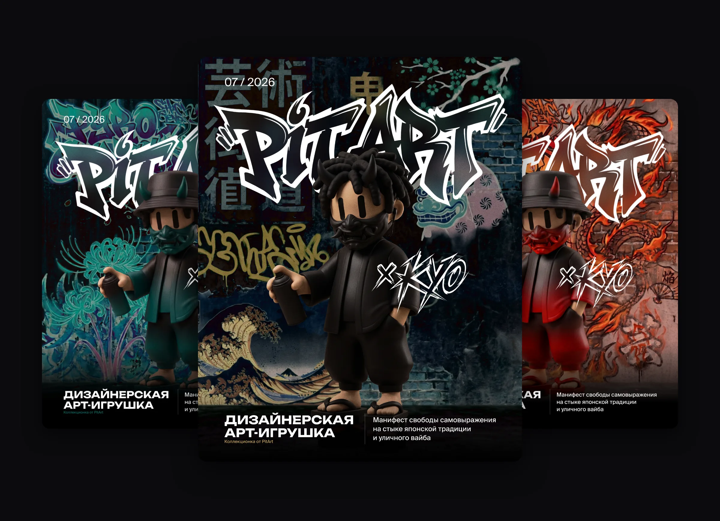
Art toy · 2026
PitArt × Kyo: design for the launch of a designer art toy
Kyo is a designer art toy of the PitArt brand: a young hero in a panama hat in a graffiti style based on Japanese mythology. We put together the launch design: a logo, a background, three color versions of the hero and carousels for Instagram.
PitArt × Kyo

The task
An art toy sells through a story. It was necessary to explain in a few posts who Kyo is and why he is like this, to show him from different sides and to make the three color versions look like one collection.
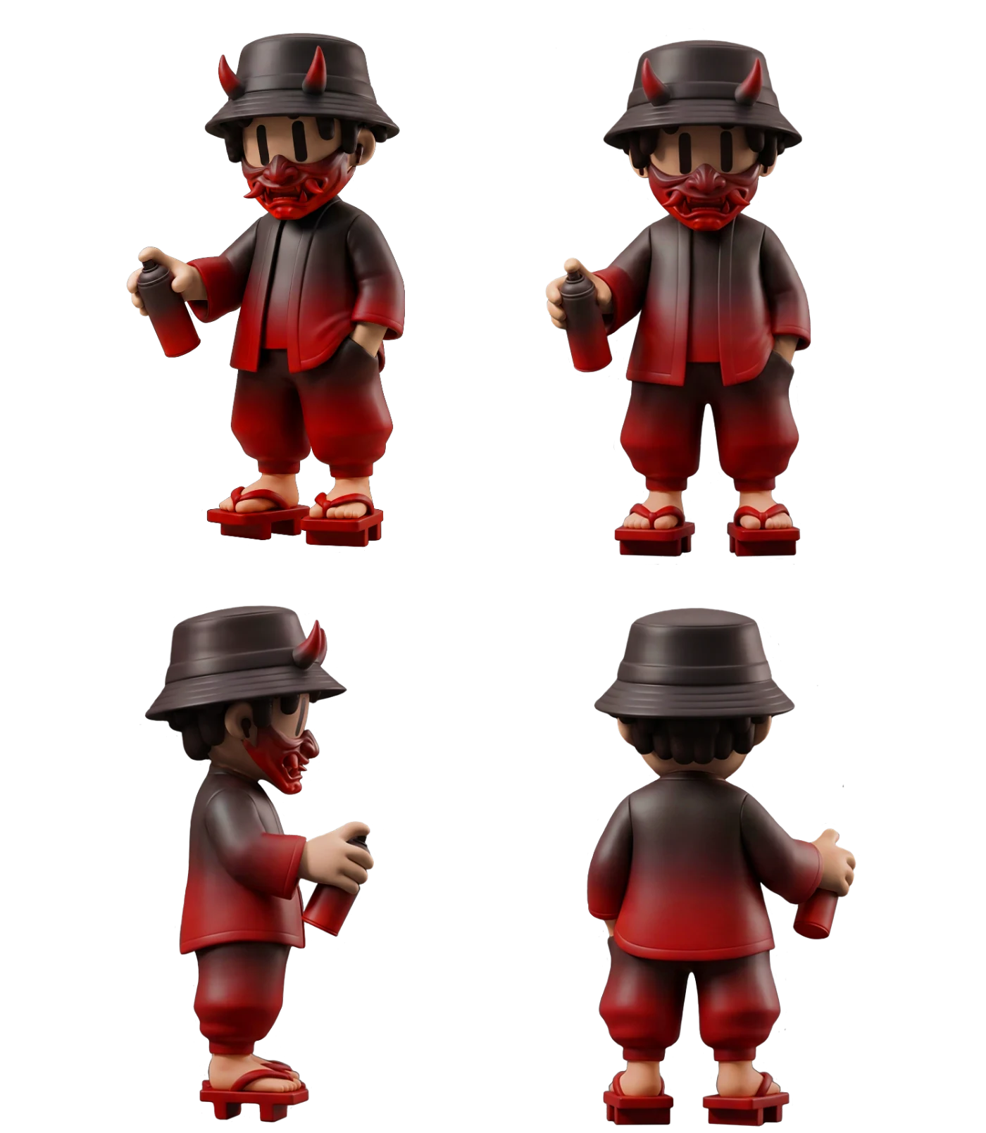
What we did
-
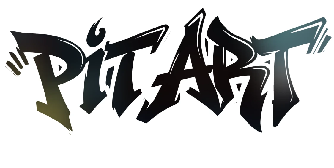
The PitArt logo
The logo is drawn in the spirit of wall graffiti: sharp strokes, sharp corners and a white outline that separates the lettering from any background.
- Readable on any background. The white outline allows placing the logo on both a dark and a bright background.
The PitArt logo -
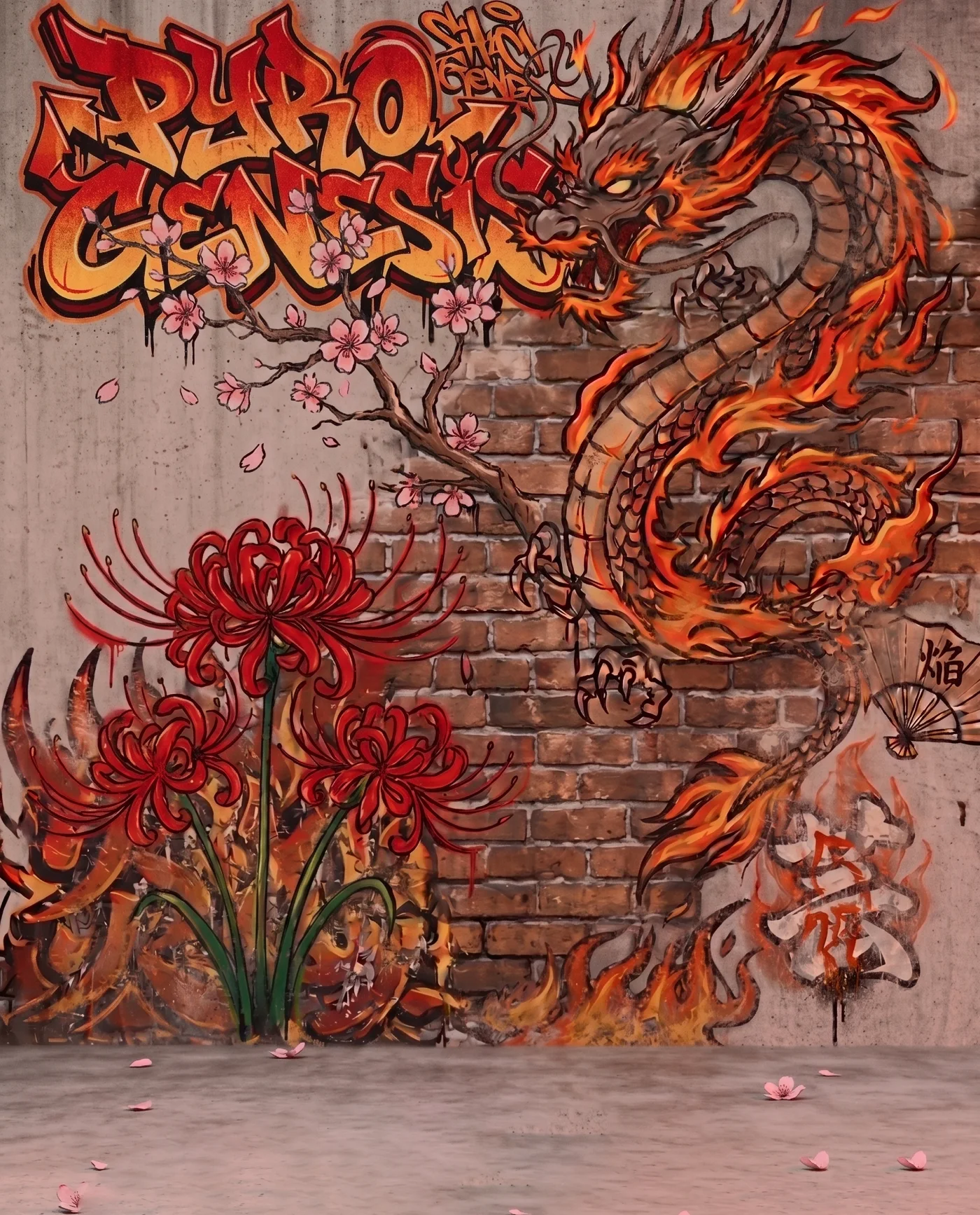
The “Pyro Genesis” background
A background was drawn for the red version: a brick wall with the “Pyro Genesis” graffiti, a dragon in fire, blooming sakura and red spider lilies. For the black and turquoise versions the backgrounds are dark with Japanese characters.
- One look, its own background. Each color of the hero got its own scene, but they are all in one Japanese-graffiti style.
The background of the red version -
Carousels for Instagram: the black version
The first series is the black version of the hero. The first slide has the logo and the caption “A designer art toy”, then three slides of the story: who Kyo is, where he lives and what his name means. The last slide asks to subscribe to the channel.
- The story of the hero. According to the legend, yokai oni are fierce demons, but Kyo is different: he is alien to aggression, wants to learn the human world and takes the name Kyo (虚), “Emptiness” or “Nobody”.
- Frame. The slide number and the release date in the corners, as on a movie poster.
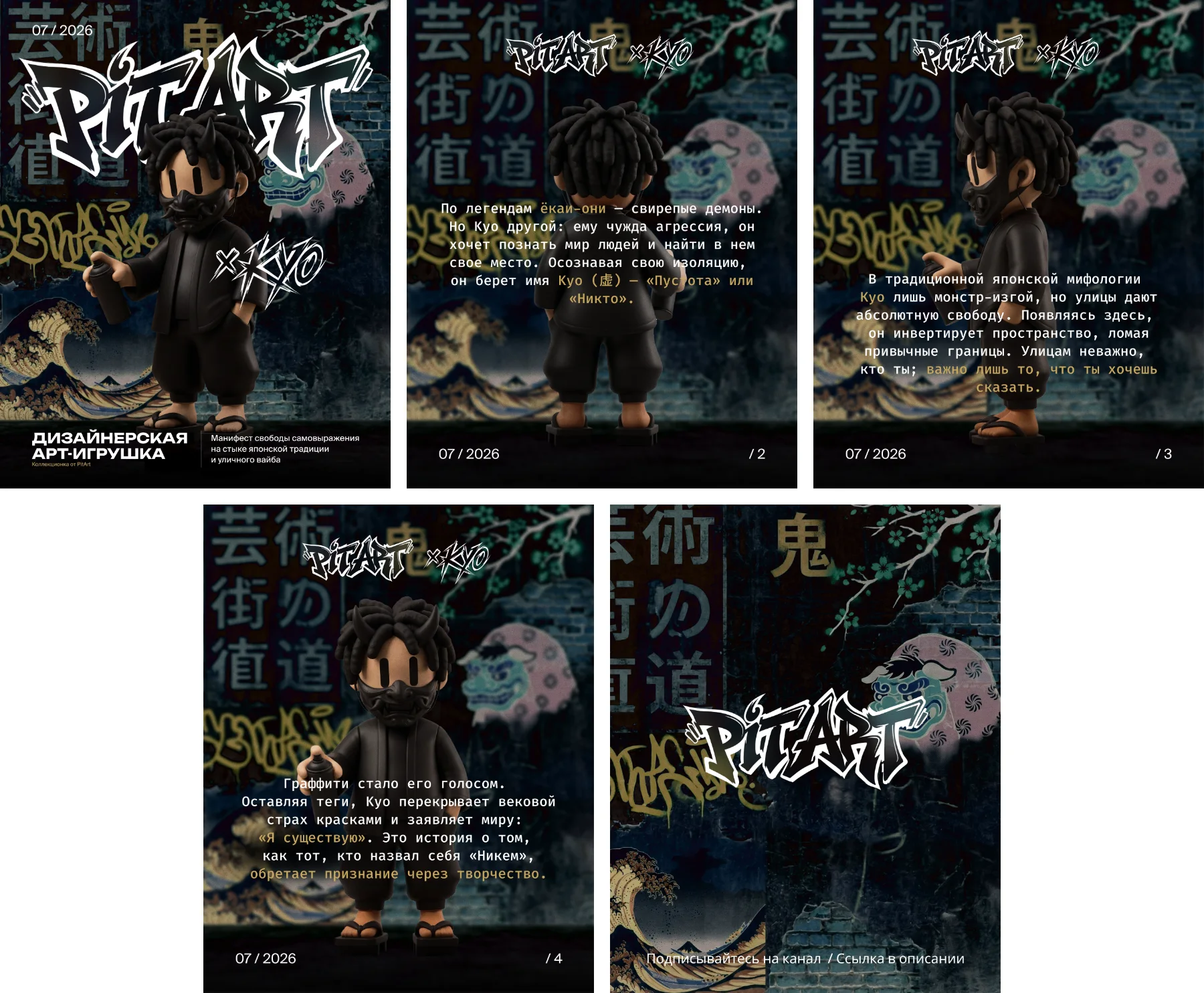
The “black version” series -
The red version
In the second series the hero is in a red mask and a red gradient. The story continues: the blooming higanbana symbolizes parting with the past, and the red gradient and the element of fire stand for an inner awakening.
- The same template. The slides repeat the grid of the first series, only the color and the background change.
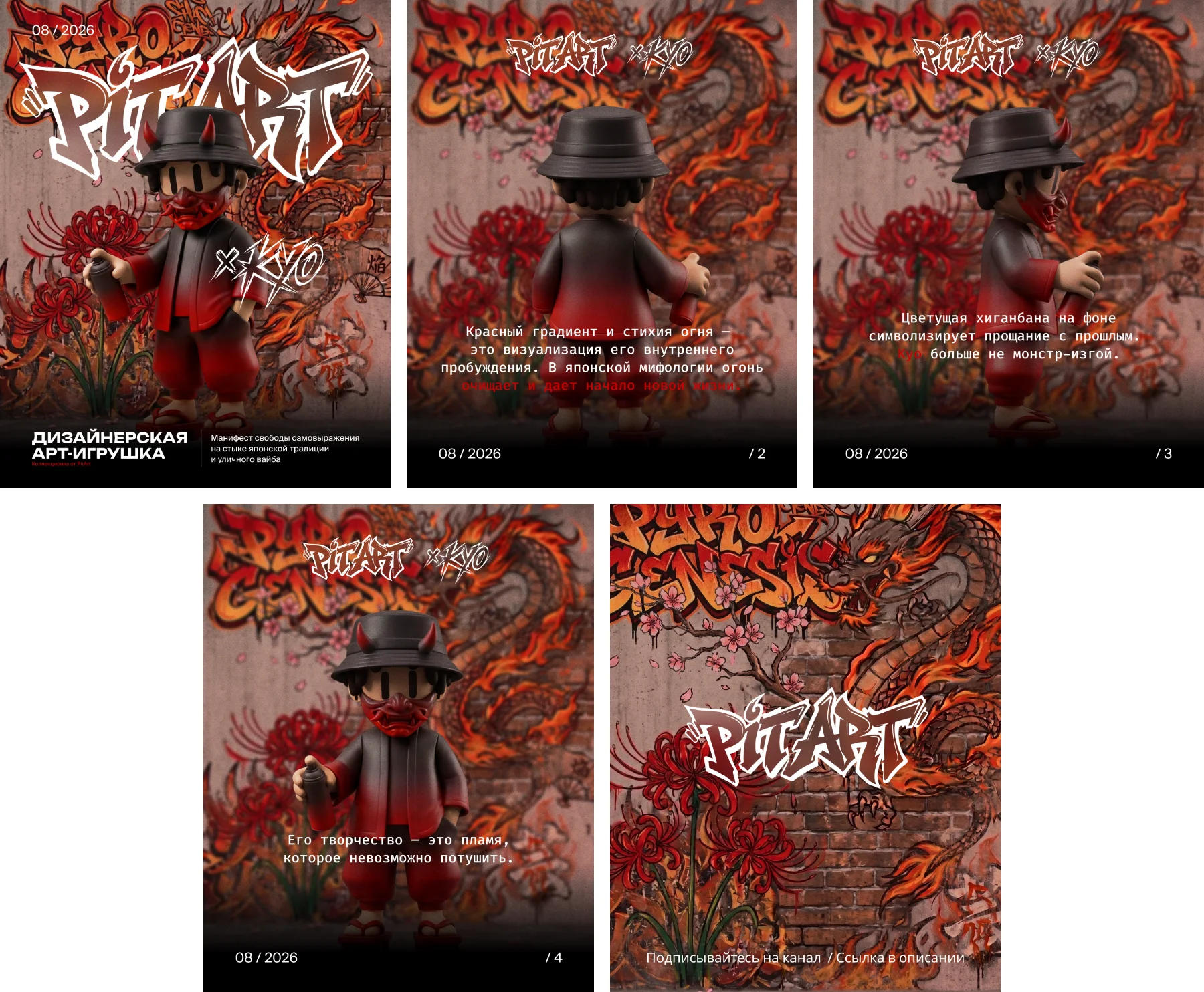
The “red version” series
The result
- A graffiti logo that works on any background
- Three color versions of the hero put together into one collection
- The hero’s story in carousels: from the cover to the call to subscribe
- Backgrounds that support the character of each version
What the work included
- Logo
- Backgrounds
- 3D visualization
- Instagram carousels
- Three color versions
Related services